US Department of Education Redesign
Project Deliverable: Desktop & Mobile Website Prototype
Team: Tena Johnshoy Barasa & 1 Researcher
My Role: Researcher & UX Designer
Tools Used: Adobe Color, Adobe XD, Dribbble, Miro, Accessible-colors.com
The goal of this project was to redesign a desktop and mobile website for the US Department of Education. We began by analyzing the design problems, and determined which issues were critical for improving usability and UI. The goal was accomplished by overhauling the navigation, reconstructing the information hierarchy, establishing design pattern consistency, and applying visual design principles.
User Research
The typical user would visit this website to obtain data, legal information,and program information relating to elementary, secondary and higher education. We created a proto-persona to better understand the user and guide us in analyzing the content of the site.
We conducted five initial user tests to evaluate the performance of the website. We tested whether or not users were able to perform simple tasks like signing up for newsletters, locating grant information or finding information on prominent legislation.
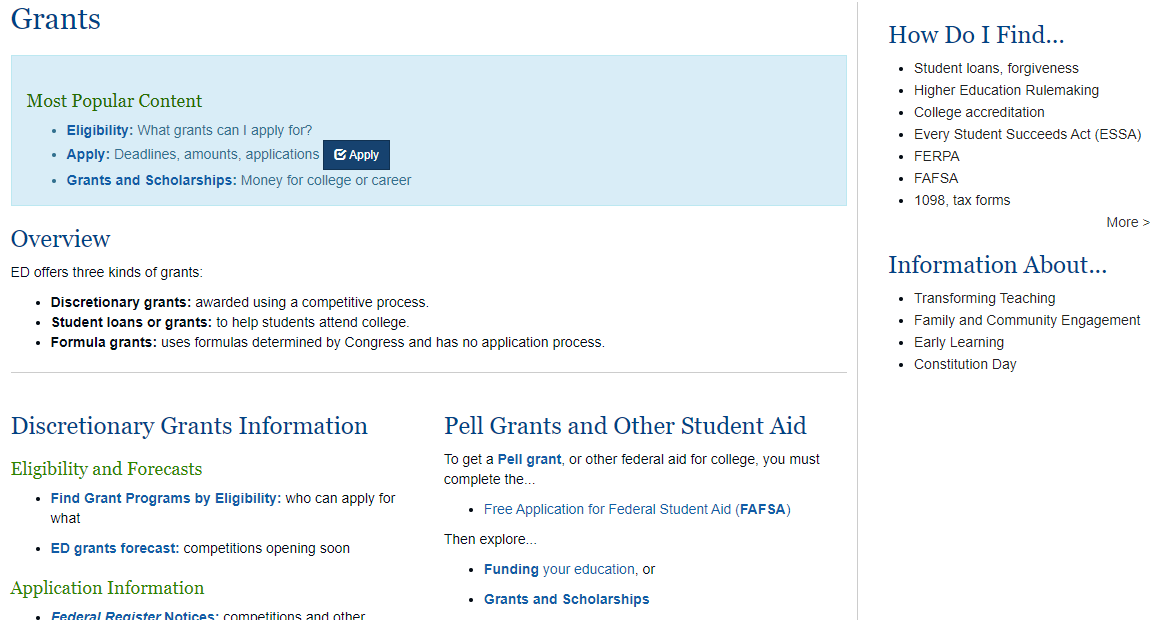
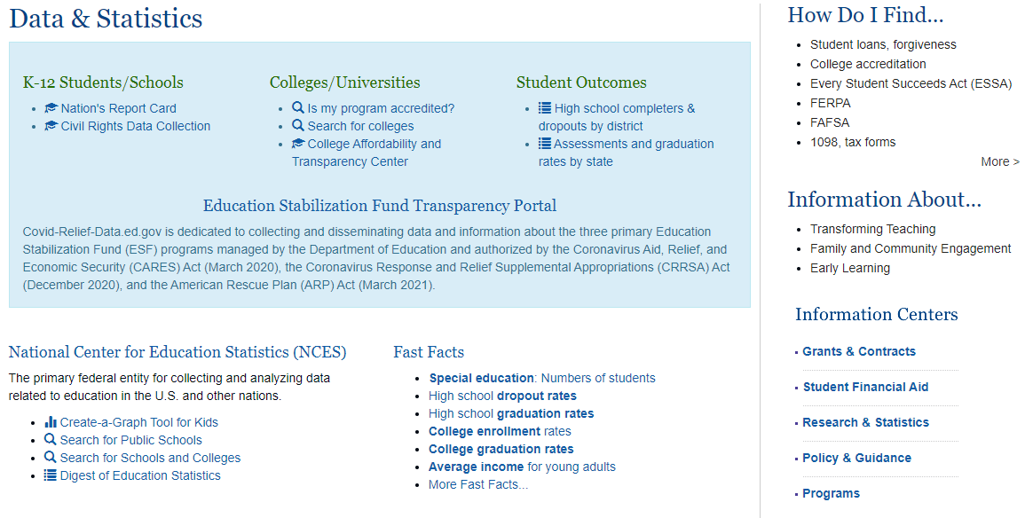
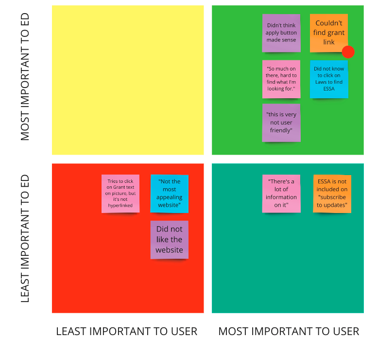
In all the tests, users struggled to navigate through the site and were not successful in the majority of the tasks. They were overwhelmed with the amount of information and found it difficult to sift through all the links and text to find what they needed.
The main pain points identified were:
- Difficulty finding content
- Overwhelming layout
- Poor information Chunking
- Broken links or features
We conducted a heuristics analysis to identify and score the problems with the current site. We combined our user feedback with our technical assessment of the website to narrow down the highest priority items:
- Optimizing the main navigation
- Restructuring the information architecture
- Reducing the amount of text, buttons and links
- Establishing consistent design patterns
The priority rankings for the redesign were determined based on how great of an impact they had on our pain points.
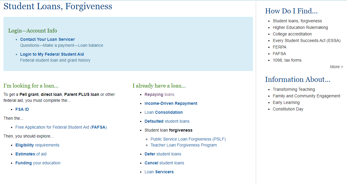
During our research we learned that many of the links on the site are used to funnel users to more specific websites, such as studentaid.gov. This realization was key in thinking about potential user flows and how editing the navigation could assist in error prevention. How might we present the content in a way that defines the site's purpose, while clearly redirecting users who have arrived in error?
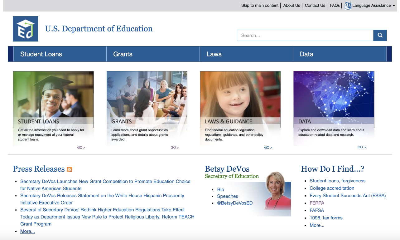
The existing navigation headings are Student loans, Grants, Laws and Data. Having a navigation heading like "students loans" and "data" is misleading to the user because it suggests this website is a resource for the information. In fact, the majority of student loan and data information is found on other government websites. In order to more clearly convey the purpose for the site, we decided to restructure the navigation.
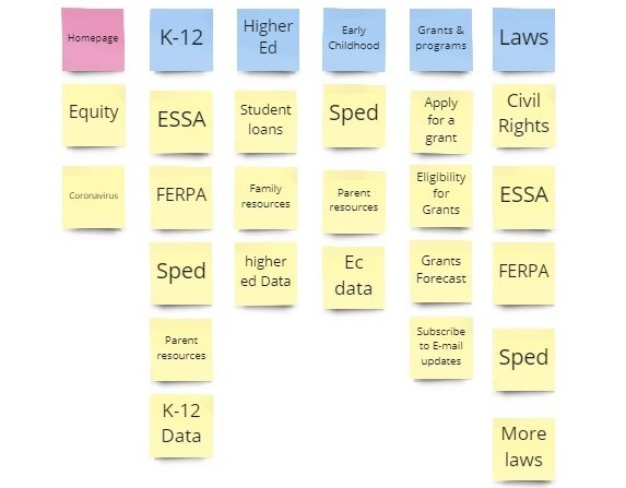
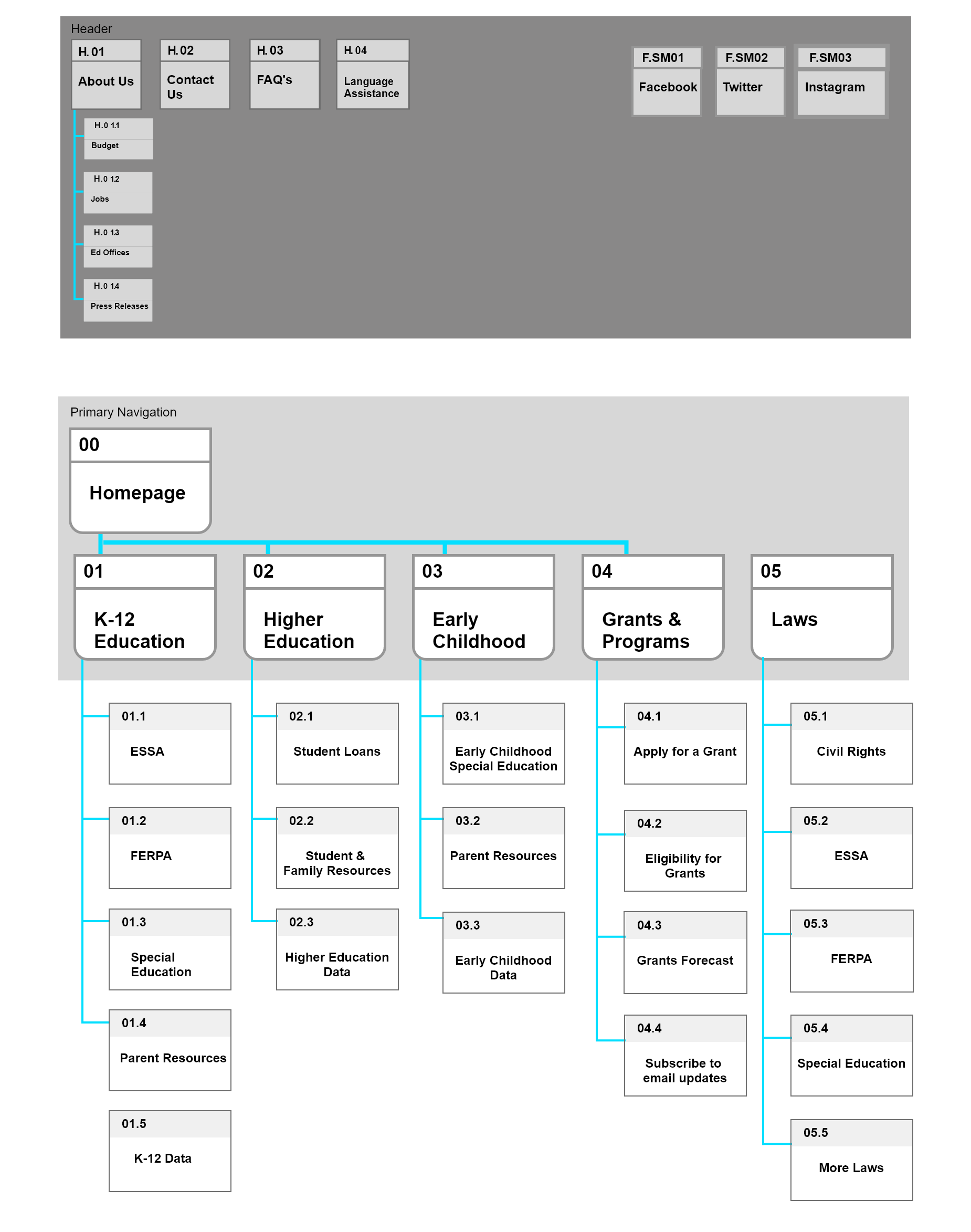
We conducted a card sorting exercise to begin work on the new sitemap and establish our new navigation. We arrived at the following headings: K-12 Education, Higher Ed, Early Childhood Education, Grants & Programs, Laws & Guidance.
With the new navigation, we were able to build out the rest of the site map with subpages. We aimed to present the information in a streamlined manner and funnel the user towards the information they need, rather than load the pages with links. The new sitemap will allow for cleaner pages which will reduce the “overwhelmed” feelings we witnessed in the testing phase.
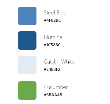
The UI direction for the website is clean, approachable and accessible in keeping with the department's mission aimed at educational equity. The color palette allows for appropriate contrast and accessibility while still creating an interesting visual experience. All the UI design choices were carefully considered, but particularly the images since this department serves the entire nation's educational systems. We were mindful to select photos that represented the diversity of the citizens, programs and age groups served.
Prototyping
We began prototyping with just the navigation and conducted 5-Second Tests. Based on our 5-second testing, the navigtation was broken into six categories rather than five, and the heading names were simplified to more easily convey the topics. The UI was also simplified to have a white navigation background since there were some problems with legibility.

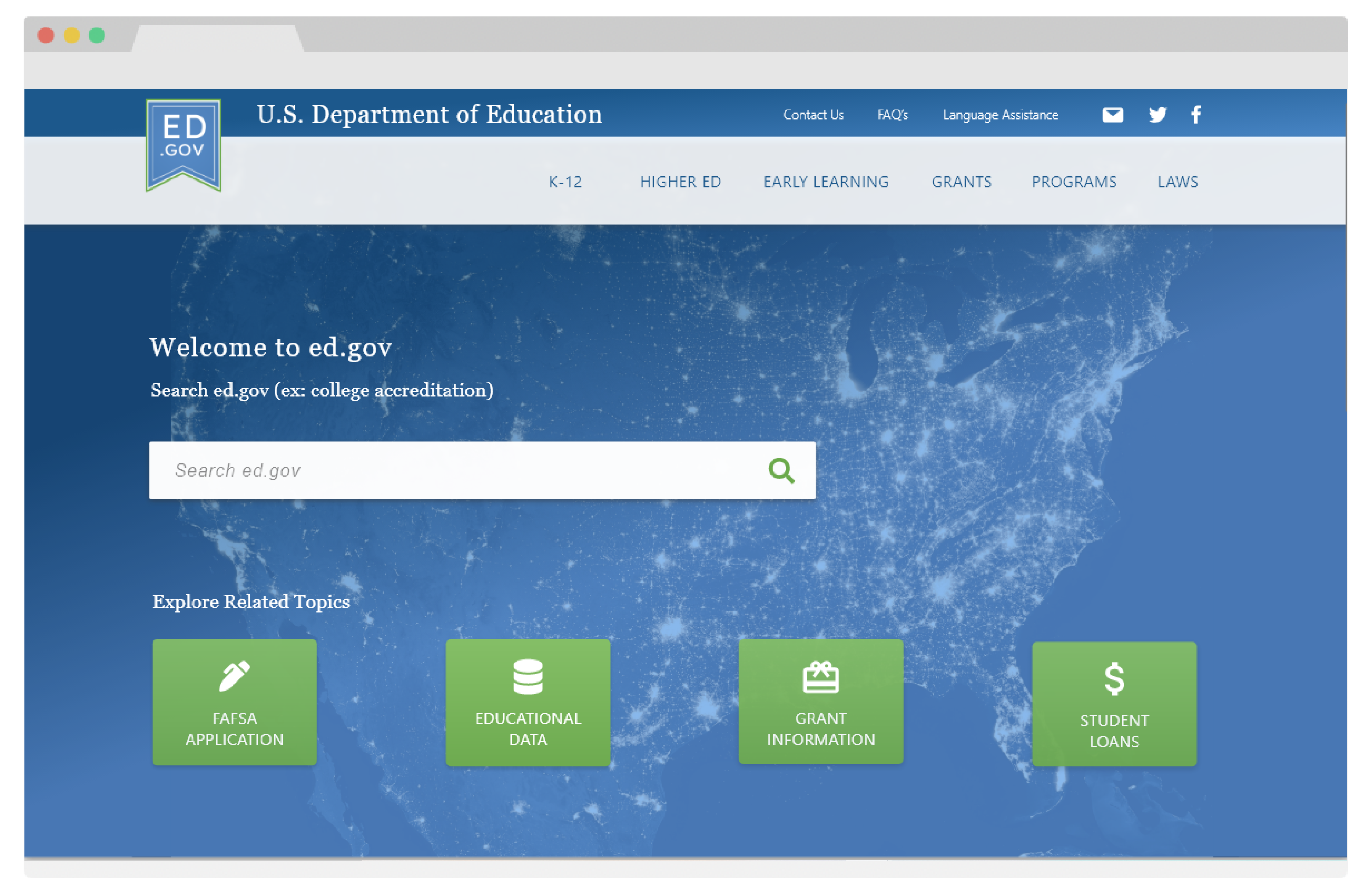
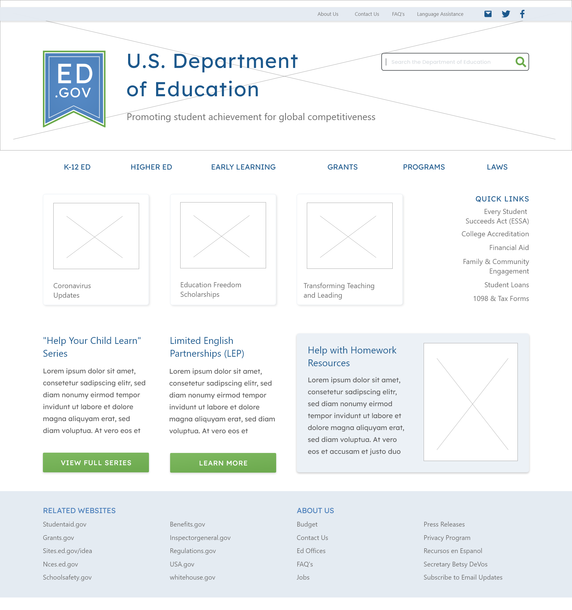
With the testing and iterations done to the nagivation, we created the wireframes for the homepage and primary navigation pages. The homepage was redesigned to include important content near the top of the page, as a replacement for the navigation images currently in use. Featured topics were moved up on the page and replaced the press releases and Secretary bio section.
Additionally, patterns were established in the wireframe that would carry through all the pages of the site. Buttons, cards, headings, and grid patterns were standardized.
In user testing it was determined that some of the key aspects of the site were not easy enough to find. To address this problem, some modifications were made to the homescreen which included large buttons that would redirect users if they were seeking information available on a different government website. The search bar was also moved on the home screen to encourage users to utilize keyword searches, given the dense amount of information on the site.
Throughout this process, I referred back to my heuristic analysis to keep focused on the primary problems. In addition to creating patterns and consistency on the site, I utilized white space to make the page easily scannable and balanced. By realigning grid items and applying higher contrast to the page elements, the page is cleaner and more aesthetically pleasing.
The Department of Educations Ed.gov site was chosen for this project due to the range of opportunities for improvement to the UX, UI and the information architecture. The results of the redesign address the major user pain points in an elegant format. The UI overhaul offers a more minimalistic and beautiful experience while maintaining the tone of a governmental website.
