Travelgistics Case Study
Travel on Your Terms.
Project Deliverable: Mobile App Prototype
Team: Mary Henry & Tena Johnshoy Barasa
My Role: UX Designer
Tools Used: Adobe XD, Google Forms, Miro, Lucidchart, Storyboard That, UXPressia
The goal of this project was to design a mobile app that helps the modern traveler plan their next trip or vacation. We had open minds before conducting our research, and were prepared follow where the research led. Still, what was learned seemed to contradict the way I thought about travel planning, and led us in a direction I was not expecting. The Travelgistics app ended up as a product that helps users plan their next trip, by not needing to plan at all!
User Research
We began our research by interviewing six individuals that were selected based on the established proto persona. The interview questions were aimed at learning the steps people take while trip planning, their priorities, and ultimately, which parts of the process were creating pain points or obstacles. In addition to the interviews, we collected survey data from 30 respondents to broaden our understanding our user.
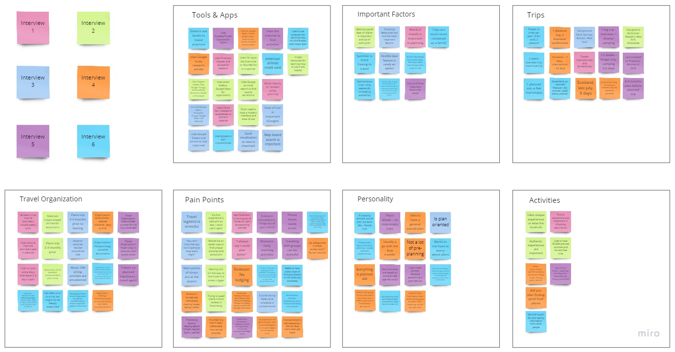
After compiling the feedback from our interviews, a few themes began to emerge:
- 1. A major pain point is finding activities and restaurants in the travel destination.
- 2. Travelers thoroughly plan travel logistics, but value spontaneity in their day-to-day itinerary
- 3. Travelers value new, authentic and cultural experiences
Furthermore, our survey data showed that 79% of respondents travel 1-3 times per year. Of this group, over 60% reported that finding restaurants or activities were the most stressful part of travel planning.
“I have an idea of what I want to do, but my plans are not deeply researched. I don’t want to have to worry about plans”
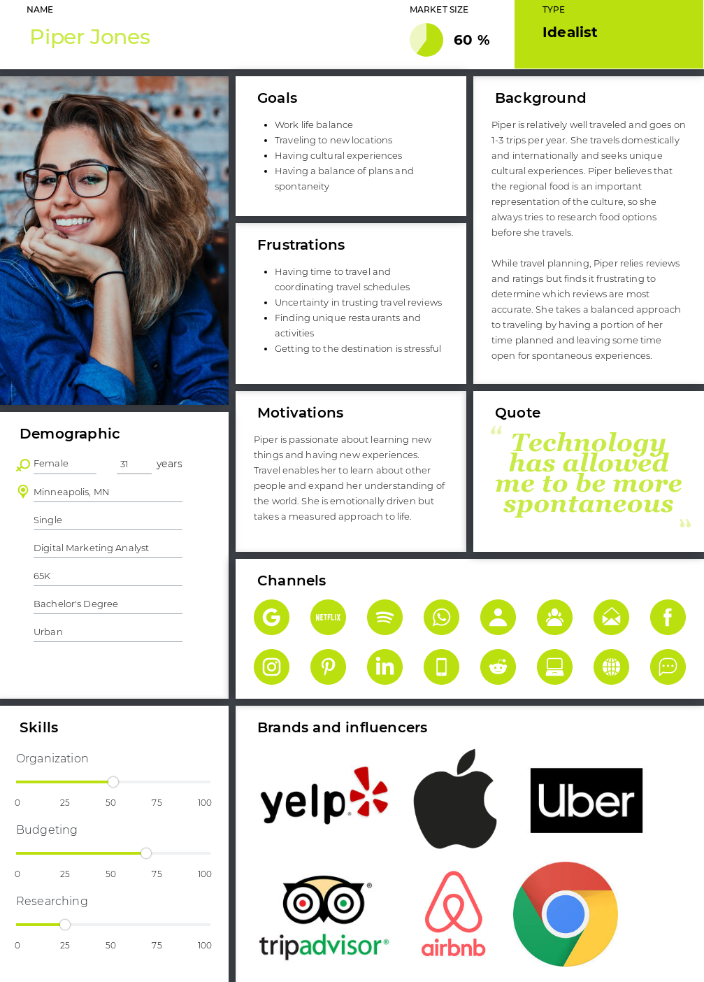
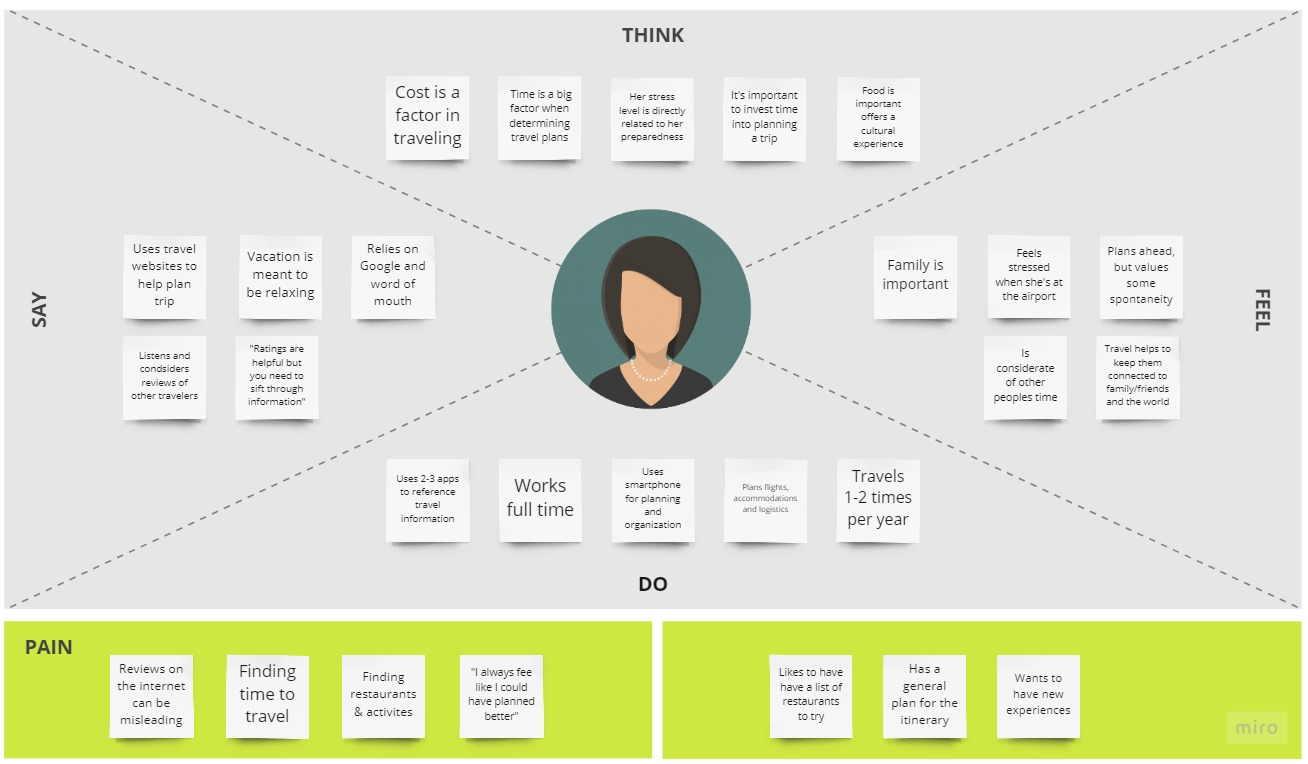
Our research allowed us to narrow down our target audience for this application. The key demographics were adults ages 25-45, working full time, who travel 1-3 times per year.The user persona is a young professional who is all about having unique and authentic experiences while traveling. She is frustrated by hours spent researching activities, attractions and restaurants. With approximately 80% of our survey respondents using 2 or more apps to assist with travel planning, the user is well versed in travel apps and knows how to access trip information while they are on the go.
Travel apps have been designed to help travelers plan the details of their vacations; However, we learned that the modern traveler finds the planning process to be cumbersome, and values spontaneous experiences.
The key pain points identified were finding activities and making day-to-day plans for a trip, which includes sifting through many reviews and finding unique or authentic experiences.
Piper is a busy professional seeking to make the most of her vacation. She needs to easily find unique restaurants and attractions while she is immersed in her travel destination because she values spontaneous experiences and doesn’t want to over plan.
Ideation
I brainstormed potential features and tools that could address the goals and paint points for the user persona. To better understand the current market for this type of app, I completed a competitor analysis. The analysis included three direct competitors and three indirect competitors. Throughout this process, I sought to understand which features are currently available, which are missing, and where I could make improvements with my app.
With a greater understanding of the current market, I organized my potential features into a value matrix to determine which features were must-haves, and which could be developed later or eliminated. I also used the competitor analysis to see the strengths and weaknesses of other apps in the marketplace, and determine where we could best offer an improved user experience and a better value.
How might we reduce the planning workload and empower travelers to be spontaneous while they are on-the-go in their destination?
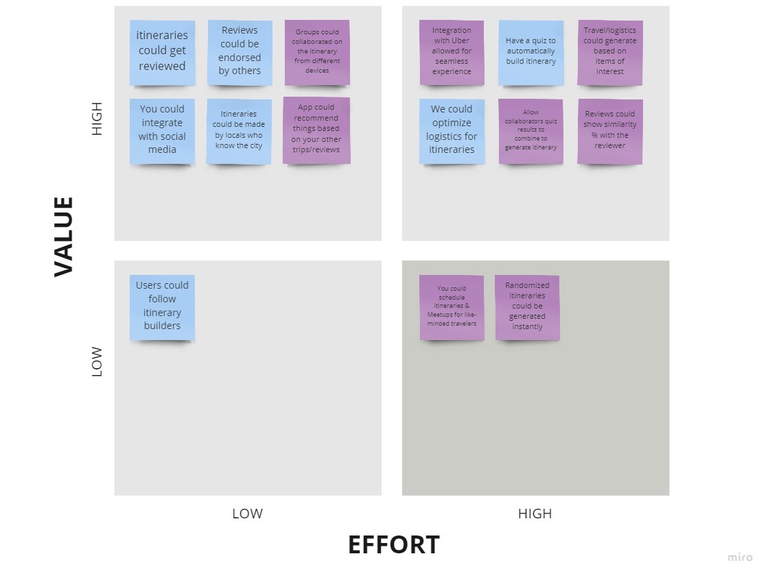
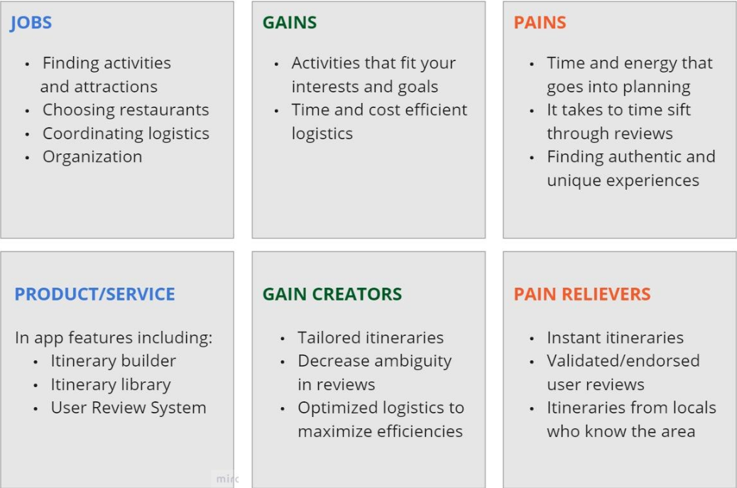
After reviewing and analyzing all of the data, three main features emerged as the best fit to address the needs of the user:
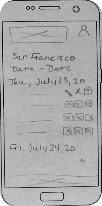
- An itinerary builder
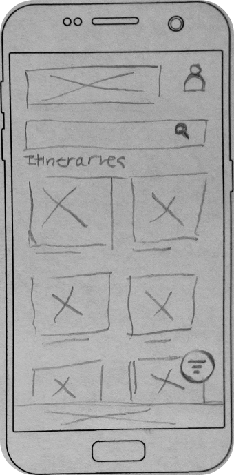
- An itinerary library
- A review system which allows for user endorsement
Prototyping
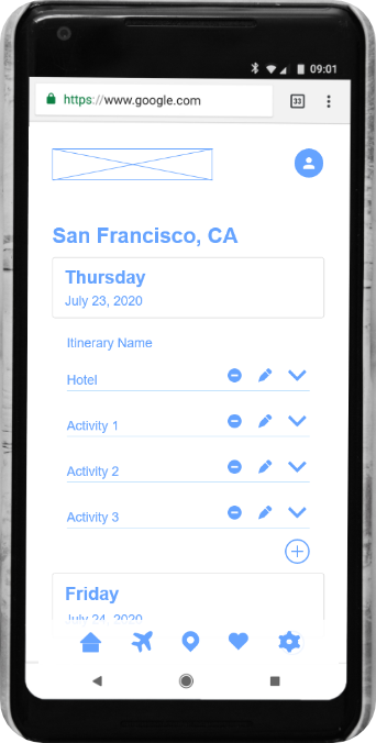
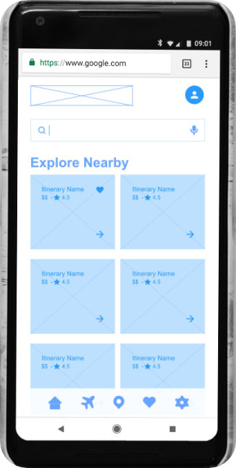
Prior to creating our low and mid-fidelity prototypes, I created a task flow diagram and user flow diagram to plot out the necessary pages for the app. I also created user scenarios and user journey maps to better understand how users will interact with the app and empathize with the user in a real world situation. I returned to the user persona to reconnect with the feelings of our traveler and imagine the various scenarios where we could address pain points.
I conducted five user tests with the objective of determining if users can successfully create a trip, find the favorites section, add an itinerary to their trip, and apply filters to their search. The usability of these features is key to ensuring users will repeatedly use the app for travel.
Problem: User testing revealed that itineraries were lacking in terms of user options, and there would be greater user gains if there were some choice available in the itinerary. This was valuable feedback but presented two big design questions:
- 1. How do we best present these options to the user?
- 2. How can we enable the user to select options in an elegant and streamlined manner?
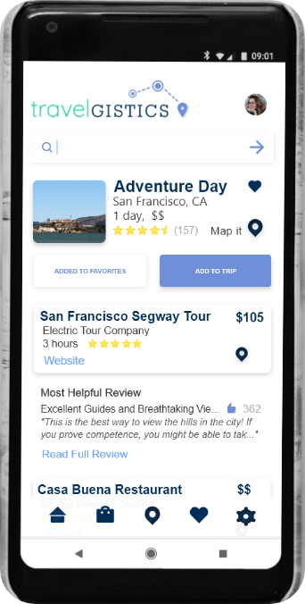
Solution: I brainstormed ideas of how to implement this change in the app. To address question number 1, I created a horizontal scrolling feature in the itinerary screen which allows for alternate options. The more difficult task was determining how to select from the options, so I came up with two potential methods. The first option was the addition of a customization modal when adding an itinerary to the trip. The second option was to offer that customization in the itinerary screen prior to adding the itinerary to a trip.
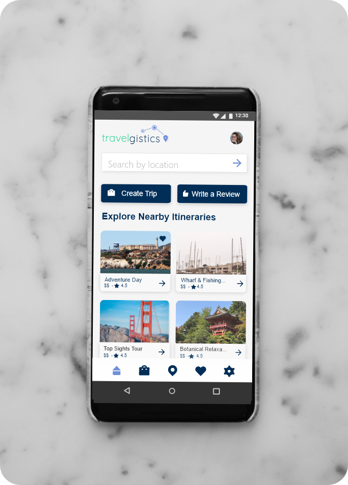
I also found was the icons used in the bottom menu created some confusion for the user. The My Trips page was emblemized with an airplane, but feedback showed that users assumed it was a link to look at flights. I replaced the airplane with a suitcase icon, and performed more testing. The icon change proved to be effective and allowed the user to more easily find their trips page.
When we began researching for this project, I was surprised to find that the average user values and enjoys spontaneity while they are traveling. Based on the research, I believe people will continue to migrate towards a more spontaneous mode of travelling since smartphones put the power in the users hands to make decisions in the moment. The end product for this project is a high-fidelity prototype that could be developed as a user-centered mobile application.
